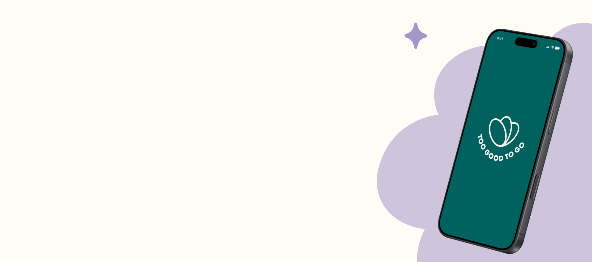
Too Good To Go
Reimagining food waste reduction through a more intuitive, user-centered digital experience.

Type
Length
Year
Tools
Figma
UX/UI Redesign
10 Weeks
2025

The Problem
Too Good To Go has a powerful mission, but users face challenges navigating the app and discovering relevant options quickly.
The Goal
Design a more intuitive and engaging experience that simplifies discovery. improves navigation, and encourages more sustainable choices.

Research
User interviews and competitive analysis revealed pain points and opportunities.
Ideate
Brainstormed solutions and mapped user flows to improve navigation and clarity.
Design
Created wireframes and mid-fidelity designs focused on simplicity and hierarchy.
Test
Usability testing validated improvements and guided Iterations.
Refine
Final high-fidelity designs delivered a cleaner, more engaging.
Key Pain Points
Overwhelming First-Time Experience
Users consistently described the app as cluttered, confusing, and difficult to navigate upon opening.
Limited Filtering Reduces Practical Use
Participants struggled to find food that matched their actual needs, especially when searching for dinner versus snacks or pastries.
Visual & Trust Findings
Current Design Feels Generic and Flat
Users felt the interface was visually basic and uninspiring, with minimal emotional connection to food discovery.
Photos Are Critical for Trust
Visuals were one of the strongest user priorities. Participants want to see real food examples, previous bag contents, and storefront or restaurant photos.
Core Design Opportunities
Recommended Redesign Priorities:
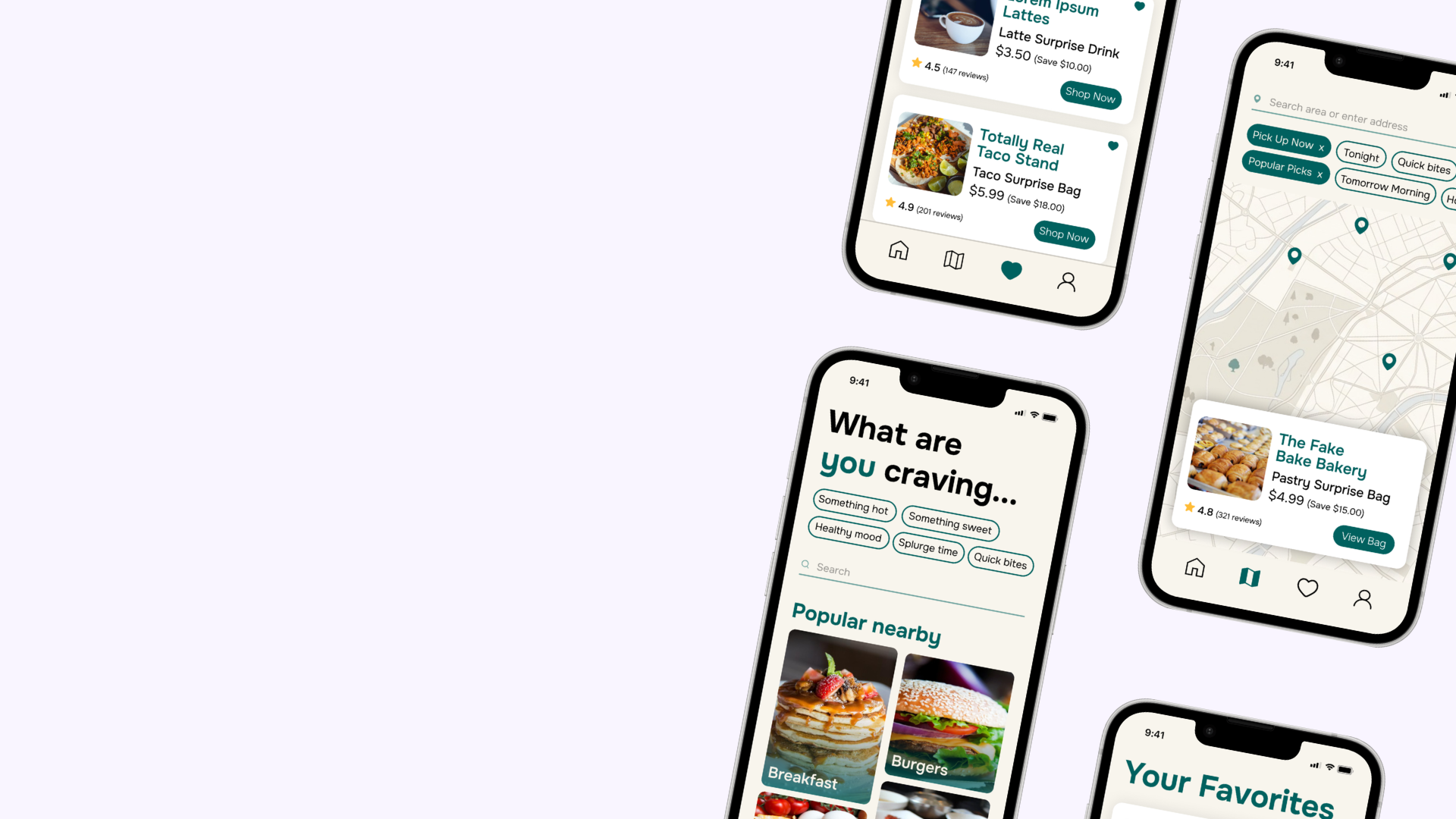
Introduce category-based navigation for faster meal discovery
Add pickup time filters for schedule compatibility
Include visual previews + user-submitted photos to improve trust
Replace generic UI with a warmer, food-centric visual identity
Offer partial bag transparency to reduce purchase hesitation
A cleaner interface, clearer navigation, and personalized discovery help users save more food with less friction.
This was a conceptual redesign, but the user research pointed to a clear opportunity: trust is the real product. Too Good To Go already has the mission and the network, the redesign just needed to make the experience worthy of both.
What I learned
Even small UX friction (an extra tap, a missing filter) can be the difference between a purchase and an abandoned session
Community-generated content isn't just a nice-to-have — for apps built on uncertainty, it's a trust mechanism
Designing for diverse users (a broke student and a busy parent) actually produces better solutions, not compromised ones
If I Took This Further
Expand user testing beyond my immediate network to include users with more varied dietary needs
Explore a ratings and review system to complement the photo feed
Test whether Vibe Categories meaningfully increase session time and conversion